
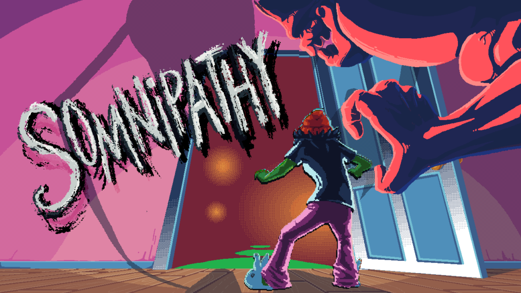
If you’ve been following along with this weekly series of blog posts, you’ve learned enough about Somnipathy to know our game has a lot of text. If you haven’t and this is the first blog post you’re reading – congratulations! Welcome! We’re glad you’re here, and we think you’ll really enjoy Somnipathy!
Because our game has a lot of text, we need to present that text to the player… which means we need to have fonts to do so. Fortunately our team includes Babs, who we have presented with the title “Empress of Fonts”.
Over the course of development so far, Babs has crafted, revised, adjusted, and finalized dozens of variations of hand-drawn fonts for us to use in the game for different purposes, different characters, and different times.
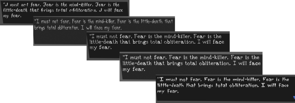
I’m an avid journaler with an appreciation for good handwriting, so having the opportunity to use tools like Calligraphr to create a unique typeface for Somnipathy was a labor of love.
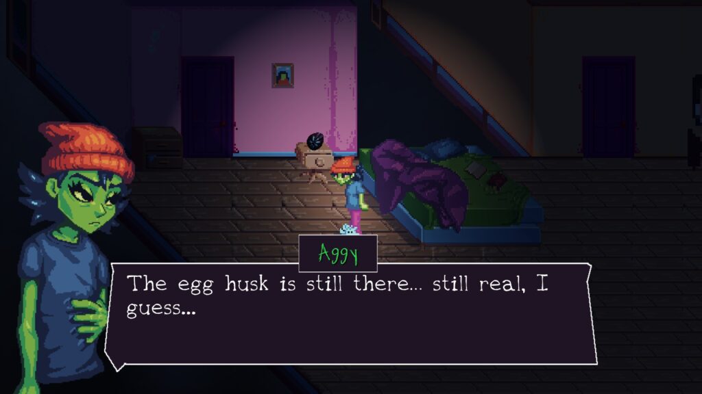
For the rest of the team, the process of seeing the fonts come together has been a sort of magic all it’s own, especially when the first few were implemented into Somnipathy and began to provide that extra layer of texture and friction for Aggy and the rest of her world. It was a very subtle but large step in making the game inside of our collective minds turn into something real…
We’ll be back next week, to talk more about Tearcell Game Studio itself, provide a proper introduction to the people behind Somnipathy, and also make a big announcement. We hope to see you then and in the meantime don’t forget to wishlist us on Steam!