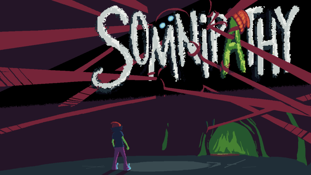
In Somnipathy the world can be very dark in many ways, but that doesn’t stop us from throwing all kinds of small details into the game in order to make it feel alive. Those small details are also one of the ways that our small team crosses boundaries between development disciplines in order to bring them to life.
Our lead writer, HighVoltageCatfish, is deeply inspired by atmospheric horror games past and considers Silent Hill 2 to be one of the all-time greats. His writing style both for Somnipathy and in general is heavily influenced by it. Yet along with wearing the hat of “lead writer”, he also serves as our primary level designer which means that he’s also responsible for making a lot of the small detail choices within the world of the game. We asked him what principles he uses when setting up the physical world that his story will be played out within, and he had this to say:
“I’ve been having a lot of fun with the synergy between writing the overall story as well as designing the levels, especially when it comes to allow players to make their own connections between things in game. Where it might be superfluous or overly verbose to have the Superintendent talk about safety measures with The Otherside, it is far more informative and concise to place some railings along an edge of an expanse along with a well-used, cluttered workbench nearby.”
Another one of our team members who crosses disciplines is pnutbutterprincess. With a background that includes work as an artist and as a programmer, she often ends up tasked with small but recurring details that hover on the line between the two. Many of the elements of our HUD design were her work, both in the code and in the on-screen appearance. Currently she has been prototyping some of the icons that will appear as part of other in-game systems that we’ll be talking about separately soon. pnutbutterprincess described her philosophy on creating those elements for us…
“There is some magic in creating elements that are both memorable and intuitive without being intrusive or confusing in some way. When creating, it can be scary to stare at a blank slate and try to come up with elements that will make sense and look good. I know that the other artists on the team all do amazing work, and they are there to back me up and help revise once we find good concepts.”
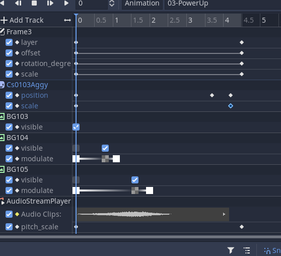
Talking about all of this sometimes fails to communicate just how involved some of the work in the Godot engine can be in order to stitch together all of the elements into a unified whole. We might be showing you fun concept art or screenshots here, but most of the time what we are all looking at is more like the image below.

Thanks for reading this week’s entry! We’ll be back in a week’s time with more from the team, and more about what goes into bringing our game to life. In the meantime, don’t forget to wishlist us on Steam!
